Advanced Visualization Tools: Generating Sunburst Charts
4th April, 2023
Data visualization is a crucial aspect of data analysis, allowing users to understand complex information and gain insights from large datasets quickly. Sunburst charts are an advanced and visually appealing tool for representing hierarchical data among various chart types. This article explores the concept of sunburst charts, explains their advantages, and provides a step-by-step guide to generating sunburst charts in Excel.
What Are Sunburst Charts?
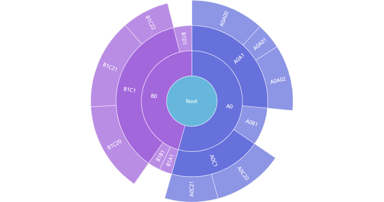
Sunburst charts, also known as “radial treemaps” or “multi-level pie charts,” are a type of information visualization that displays hierarchical data structures in a circular format. These charts consist of concentric circles, each level representing a layer in the hierarchy. The innermost circle represents the “root” node, and each subsequent ring displays the “children” nodes of the previous level. The size of each segment is proportional to the value it represents, making it easy to compare and identify trends within the data. The following is an example of what a sunburst chart looks like:
An Application of Sunburst Charts
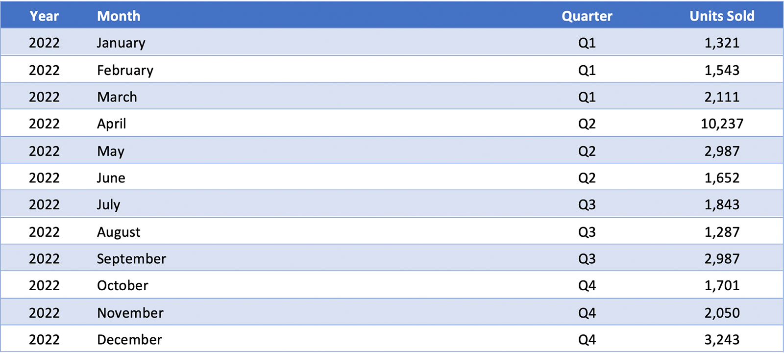
For example, let’s say that a Dubai-based supermarket is analyzing its sales of Vimto during 2022. Data generated from its ERP shows the following:
A typical way of visualizing this data is through a bar chart graph:
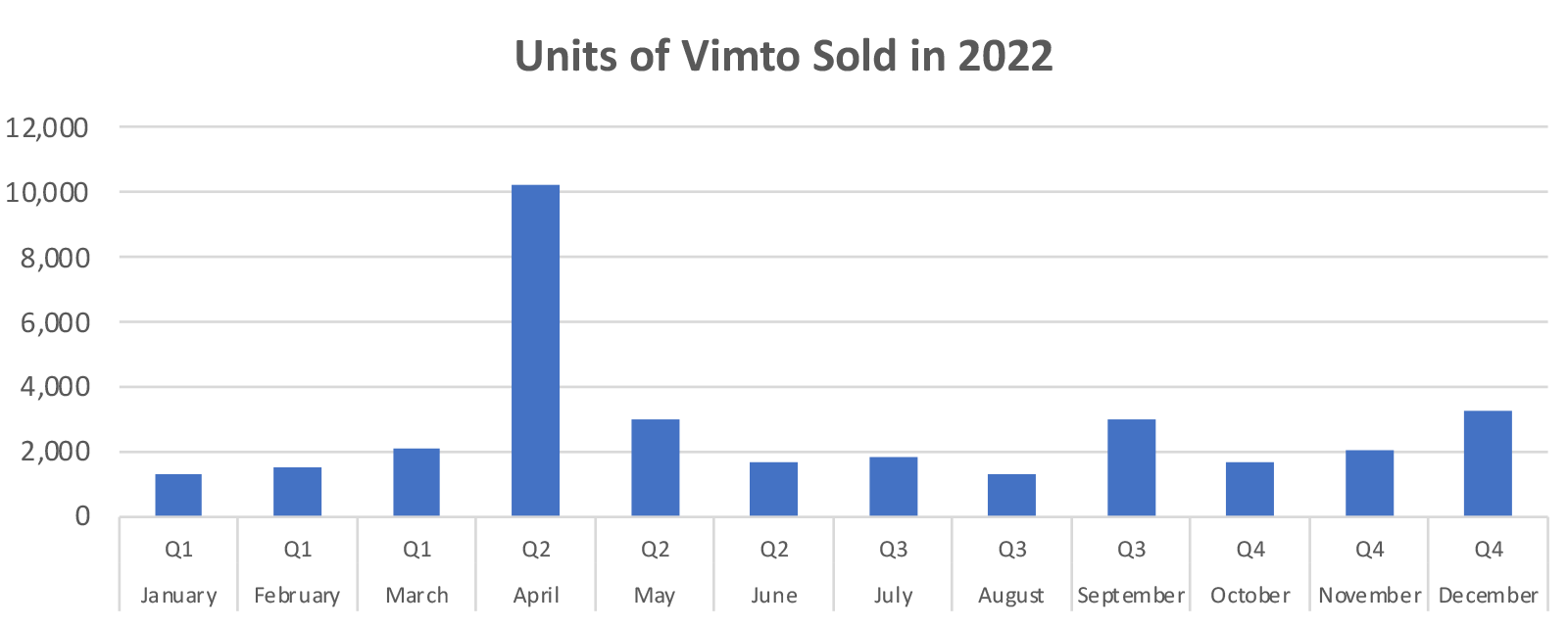
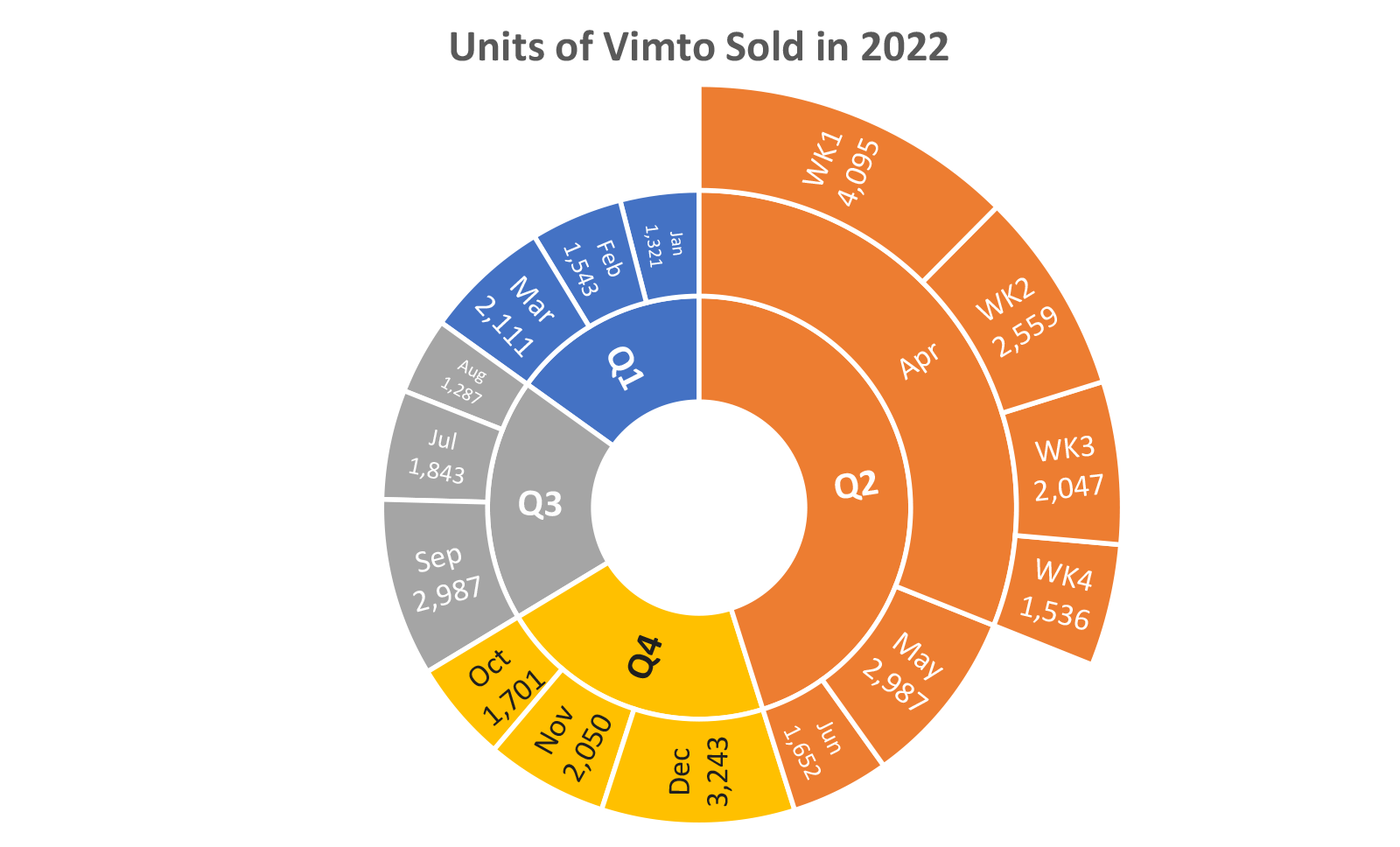
Naturally, more intricate ways exist to show this data (for example, by using vertical/horizontal stacked bars). While this is perfectly acceptable, a sunburst chart is more visually appealing and allows the audience to focus on specific areas of interest. A sunburst chart generated from the ERP data using Excel will look like this:
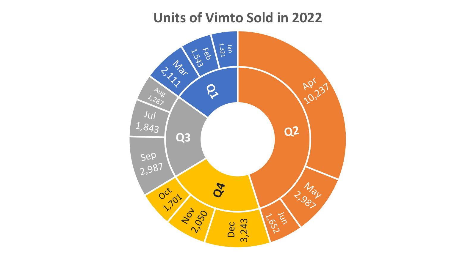
The above sunburst chart shows that Q2 is the most popular quarter for Vimto sales. Additionally, within Q2, April is the month for Vimto sales in Dubai (can you guess why). Let’s say your manager wants a more granular view of April and wants you to show the sales broken down by week. Going back to the ERP data, you find that the weekly data for April is 4095 for the first week, 2559 for the second week, 2047 for the third week, and 1,536 for the final week. By adding another layer of weekly data (for April only), the new sunburst chart will look like this:
The Advantages of Sunburst Charts
1. Intuitive Representation of Hierarchical Data: Sunburst charts offer an intuitive way to visualize hierarchical data, making it easy for users to understand relationships between different levels and categories.
2. Space Efficiency: Sunburst charts can represent large datasets with many categories compactly due to their circular layout. This makes them particularly suitable for visualizing data with multiple hierarchy levels, where traditional tree diagrams or bar charts may need to be more attractive.
3. Visual Appeal: Sunburst charts are visually engaging, allowing users to quickly grasp the structure of the data and identify patterns or trends. Using color and varying segment sizes can also help highlight specific data points and make the chart more accessible.
Generating Sunburst Charts in Excel: A Step-by-Step Guide
To create a sunburst chart in Excel, follow these steps:
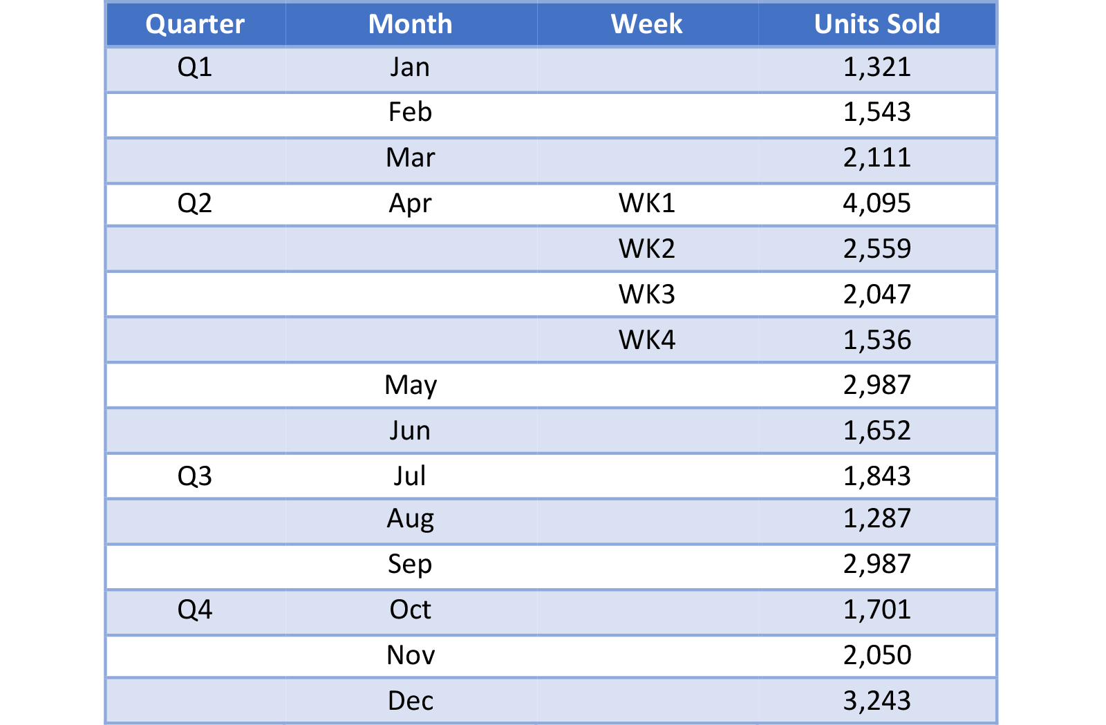
1. Prepare the Data: Ensure your data is organized hierarchically, with each level represented as a separate column in your dataset. For example, the Vimto data needs to be rearranged into the following table:
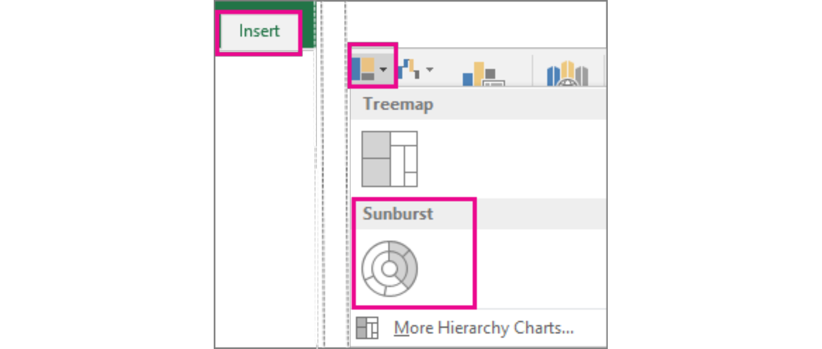
2. Generate the Chart: Select the data you want to include in the sunburst chart. Click insert -> Insert Hierarchy Chart -> Sunburst
3. Configure Settings: Review the generated sunburst chart to ensure it accurately represents your data and provides the desired insights. Adjust the chart settings, such as changing colors or segment sizes, to improve clarity and readability.
Conclusion
Sunburst charts offer an advanced and visually appealing way to represent hierarchical data, making them an excellent choice for analyzing complex datasets with multiple levels of hierarchy. Following the steps outlined above, you can generate your sunburst chart and unlock valuable insights from your data. Like any visualization technique, the key to success lies in choosing the right tool, properly preparing your data, and refining the chart settings to communicate the information best.
About the Author

Related Articles

Conversations with AI: Accounting for Leased Assets by the Lessee
I had a conversation with AI “Claude 3.5” regarding IFRS 16 and the requirement…
nassimo
22nd September, 2024
Read More
Developing Leadership Presence
Leadership presence is a crucial aspect that sets exceptional leaders…
nassimo
20th June, 2024
Read More
Conquering the Tempest
Leadership and resilience, often dormant in individuals, can emerge as…
nassimo
18th April, 2024
Read More
Kaali Peeli Epiphany: Unveiling the Currency of Contentment
Lao Tzu once said The one who knows he has enough is rich. This is an…
nassimo
16th April, 2024
Read More


